If there’s one thing I’ve learned in the two years I’ve just spent in grad school (an all-too-short, intercontinental reprieve from working life that just ended with Thursday’s graduation ceremony), it’s that diversions from studying and writing papers are absolutely crucial in order to stay sane.
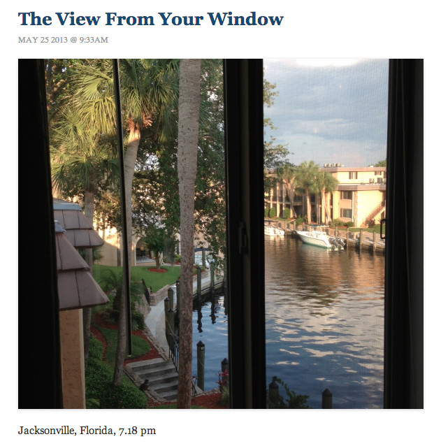
Enter The Dish. Longtime readers of my blog (hello, family) will know that I’m a Dish obsessive, and I probably spend more time scrolling through its contents than on most other sites combined. One of the blog’s most popular features is the View From Your Window, which is really two features in one. In the daily version, Andrew Sullivan posts a reader-submitted picture of a view from a window, with a caption revealing where the photo was taken. And in the weekly feature that runs every Saturday, Sullivan posts a view from a window without any caption, inviting readers instead to guess the location. Dish readers are scarily accurate, generally finding the exact window of whatever building the photographer was in when (s)he snapped the photo. (And yes, I will be sending in a guess for Saturday’s View From Your Window contest.)
Since I’ve spent much of the last month or so cramming in last-minute papers, reports, and presentations, the need to escape has become more pronounced as well. And so that is how I came to catalog — sporadically, in fits and starts between bursts of academic inspiration — every daily and weekly View From Your Window post in the “modern era” of VFYW — the honorary category I’ve awarded to the library of posts starting from the very first weekly contest on June 9, 2010. (The source file is available here.)
This is, of course, a necessarily arbitrary cutoff point. The Dish‘s View From Your Window posts have been going on for years (since May 22, 2006, in fact), long before the start of the weekly contest. (As of April this year, The Dish had published over 2,700 VFYW photos.) But quite frankly, I had neither the time nor the stamina to log every single View From Your Window throughout The Dish‘s history. (I’m certain there’s some non-manual way to do this via page-scraping or something, but I haven’t figured that out yet.) And anyway, the 1,228 posts I recorded between June 9, 2010 and May 25, 2013 — a period during which The Dish itself was hosted on three separate sites: The Atlantic, The Daily Beast, and now independently via WordPress — seemed like a large enough sample size to provide a solid idea of VFYW trends.
As far as I know, this is the first-ever long-term study of the View From Your Window feature. The closest (and much cooler) cousin to this concept that I’ve seen is Llewellyn Hinkes-Jones’ View From Your Window game, in which — with a limited number of guesses available — the contestant must click on the correct sector of a map, as the view zooms in ever closer before finally zeroing in on the location of the photo. But as far as I know, no statistical study of VFYW has ever been conducted. (Cue the drum roll…”until now.”)
Going back through the archives was more fun than it sounds. (That said, the old military axiom — “It’s 99% boredom punctuated by 1% of sheer terror” — roughly applies here too, although terror should be replaced by something more pedestrian. “Pleasant surprise,” maybe?) Although most daily posts simply contained a photo and a caption listing the city and country, occasionally I’d run across some tearjerking post about a reader’s brother succumbing to his injuries in a hospital from which a VFYW photo was taken, or an admonition from another watchful reader not to include photo EXIF data in the weekly contest. (My personal favorite? My girlfriend’s submission from Alaska while clerking there last year, of course.)
The coincidences, too, were startling — none more so than the case of the reader who responded to the weekly contest by noting that he was sitting, by happenstance, in the very same room where the contest photo had been taken by someone else. And I couldn’t help but laugh at the August 3, 2010 post in which one reader marveled at his fellow contestants: “Gosh, you would think Dish readers could find Bin Laden if you made it into a contest!” Turns out, one did.
As a side note, one element from the very earliest contests that I wish The Dish still included — but which, I’m guessing, is no longer feasible due to the increasing size of its readership — is the Google Maps screenshot with pins showing all the guesses submitted for that week’s contest.
So then…to the numbers. Of the 1,228 posts through May 25, 2013 that I catalogued (including both the daily photos and weekly contests), 636 — or 52% — were from the United States. (This is, believe it or not, an underrepresentation. According to SiteMeter, 67.3% of The Dish‘s readership — it doesn’t specify over which time period, as far as I can tell — is from the United States.) The runner-up is, unsurprisingly, England at 36, followed by Canada at 29. (Italy [27] and China [25] round out the top five.) In all, 144 countries were featured.
New York was, by a very long shot, the most popular city. Nothing else even came close: with 55 photos, New York City constituted 4.5% of the total. (For the record, I included all five boroughs under the rubric of NYC, even when they were captioned as Brooklyn, Queens, and so on.) Second place fell to San Francisco, with 17. (Washington, D.C. [13], Chicago [11], and London [10] rounded out the top five cities.)
Within the United States, although New York City took the municipal crown, the state of California edged a slight victory over the Empire State and simply blew away the other 48. With 85 photos, California bested New York by a mere four, but the third-place state, Colorado, had only 28. Massachusetts, at 24, and Washington, at 23, completed the top five. In fact, all 50 states were represented in The Dish‘s VFYW “modern era,” with Delaware, Mississippi, and West Virginia taking home one photo apiece. (Of those three, only Delaware’s was a contest photo, however.)
Of the 154 weekly contests to date (not including the May 25, 2013 contest, whose winner will be revealed on Tuesday), 41 photos (27%) hailed from the United States: six from California; three each from New York, Georgia, and Alaska (!); and two each from Massachusetts, Michigan, Minnesota, Texas, and Arizona. In all, exactly half of the states were featured in a VFYW contest.
Alaska is, to me, a particularly interesting phenomenon. Featured 20 times (for eighth place among U.S. states), including three contests (tied for second), it’s a disproportionately popular state for VFYW. This got me thinking: what are some of The Dish‘s most statistically improbable View From Your Window selections?
First, I downloaded some data from sources of various reliability. For American state and city populations, I used the U.S. census from 2010. For country populations, I used World Bank data. And for square mileage by state, I used…Wikipedia.
Using this data, I entered the number of times a given state was featured on View From Your Window (again, including both the daily and the contest versions), divided it by the state’s population, and multiplied by 1,000,000 to obtain the ratio of VFYW per million residents. By this metric, Alaska was far and away the most overrepresented state in the Union: 28.16 VFYW photos per million residents. (In reality, Alaska has only 710,231 residents.) Mississippi, meanwhile, with nearly three million residents, had only one VFYW entry. This makes it the worst-represented state, with a ration of 0.34 VFYW photos per million residents. (For what it’s worth, despite not being a state in any technical sense, the District of Columbia was the second-most-represented state/district, at 21.60 VFYW photos per million residents.)
The same holds true if counting only contest photos. Alaska once again dominates, with 4.22 VFYW contest photos per million residents. The next-closest is Vermont, at 1.60. The worst-represented state for contests is North Carolina, which at 9,535,483 residents, is the most populous state not to have a VFYW contest photo.
But once I flipped things around and measured View From Your Window photos by state square mileage rather than population, Alaska moved from first place to nearly last. With 0.03 VFYW photos per 1,000 square miles, the state was ahead of only North and South Dakota, New Mexico, Utah, Mississippi, and Nevada. Meanwhile, the District of Columbia — with 190.23 VFYW photos per 1,000 square miles, was in an entirely different league than all the real states, the closest of which was Rhode Island at 2.59.
Again, using only contest photos, Alaska fares the worst of the states that were featured at least once: rounded to two decimals, it had 0.00 VFYW contest photos per 1,000 square miles. Nevada, however, was the worst of all: it contains 110,560.72 square miles of God’s green earth, and not one View From Your Window contest submission.
Not to politicize anything — God knows I’m never political on this blog (smirk) — but all eight least-represented states for VFYW (as in, the worst ratios of photos per million residents) voted for Mitt Romney in last year’s presidential election. Meanwhile, 11 of the top 14 most-represented states voted for Barack Obama. This is, of course, unsurprising: he may self-identify as a conservative, but Andrew Sullivan’s readers are overwhelmingly liberal.
As is probably clear by now, there are a million and one ways to slice and dice the data. Fortunately for you, I had enough finals, procrastinatory endurance, and capacity for time mismanagement to collect the data over the past few weeks. Now, using the source file, you can mess around with the numbers and throw in new angles yourself.
Below: a map of all View From Your Window locations in the “modern era” — from June 9, 2010 through May 25, 2013.

Post Revisions:
This post has not been revised since publication.