A week ago, I took a look at Andrew Sullivan’s blog, The Dish, in order to see how the implementation of a “Read On” meter had affected the content structure of his blog. I found the following:
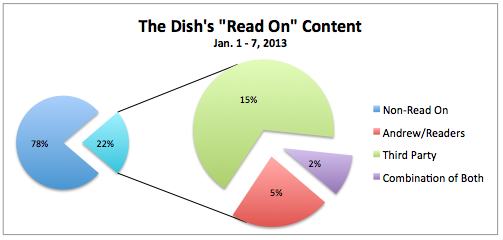
Bottom line: Andrew Sullivan has almost perfectly inverted his “Read On” content from before to after the implementation of the meter. From January 1 to 7, he posted 231 times; of those, only 52 (22.5%) included “Read On” buttons. Of those 52 “Read On” sections, 35 consisted primarily of third-party content (67.3%), 12 mostly contained material produced by Andrew and his readers (23.1%), and the remaining 5 were a combination of Andrew/readers and third-party content (9.6%).
From February 4 to 10, however, several things changed. The number of total posts was almost identical to the January period (227), but — as he promised — there were significantly fewer “Read On” posts in the first week of the new meter (27, or only 11.9% of the total). Of those 27, 19 contained content primarily contributed by Andrew and his readers (70.4%), 5 contained a combination (18.5%), and only 3 “Read On” sections during the entire week contained content mostly attributable to third parties (11.1%, or 1.3% of the entire population of posts this past week).
For more on the methodology of exactly how I categorized Sullivan’s various posts, see the original post. The first graph below depicts the stats for January 1 – 7, a week I chose as the control group for The Dish‘s content structure before the meter:
This second graph portrays the composition of The Dish‘s content from the very first full week that the meter was in effect, February 4 – 10:
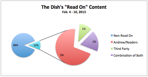
As Sullivan pointed out, The Dish rolled out the meter slowly in its first week: compared to the control week in January, when 22% of all posts contained “Read On” buttons, only 12% of all posts had the button in the first week of the meter. Furthermore, the type of content behind the meter was quite different: whereas the control period was dominated by third-party content beyond the “Read On” button, in the first week of the meter the majority of “Read On” sections primarily contained content produced by Andrew Sullivan and his readers.
Because that first week under the new meter was intended to be a bit of a test run, it remained to be seen how the stats would change (or stay the same) once the “Read On” button began to be used at a more normal frequency. So as a follow-up, I’ve now conducted an identical study of the very next week, February 11 – 17.
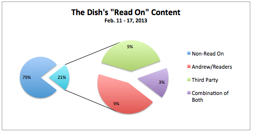
The total number of posts was similar to that of the previous two periods (237). Of those posts, 50 (21.1%) contained a “Read On” button: note that this is almost exactly the same percentage as in the control week (22.5%). Of those 50 sections located after the “Read On” button, 22 (44.0%) contained content primarily produced by Andrew and his readers, 20 (40.0%) contained content mostly taken from third-party sources, and the remaining 8 (16.0%) contained a combination of both. See the graph below:
Again, I have shared the entire Excel spreadsheet here, in case anyone wishes to contest my methodology or categorization. As I mentioned in my original post:
Obviously, there is a small subjective element to the endeavor. However, this is probably much less significant than one might think: the vast majority of posts on The Dish – and this applies equally to the “Read On” and non-”Read On” sections of each post – quite clearly fall into one of the three categories specified above: content produced primarily by Andrew and/or his readers, content produced primarily by third parties, and content containing a mixture of both.
So after a pretty significant dip in “Read On” posts in the first week of the meter — while the kinks were being ironed out — The Dish‘s content has since returned to its pre-meter ratio of non-“Read On” to “Read On” posts. However, what lies beyond the meter has shifted: whereas 67.3% of all “Read On” sections before the meter contained mostly third-party content, now the plurality of “Read Ons” (44.0%) consist of content provided by Andrew and his readers (from analysis to letters to views from people’s windows). The proportion composed of third-party content has fallen to 40.0%, with the remaining 16.0% of all “Read On” sections comprised of material that contains both.
What this likely means is that Sullivan and his team have taken to heart the precautions of readers and commentators who noted that, to charge for content, the part that’s hidden to non-subscribers should tend to be more original — as opposed to a curation of third-party material.
One thing I didn’t touch on in my original post, but which I did measure, is the composition of every post before the “Read On” button — that is, the portion of each post one can see whether or not one is a subscriber. (This includes posts without a “Read On” button at all.) In the January 1 – 7 period, content was divided thusly: 67.5% of pre-“Read On” sections were primarily third-party content, 21.6% were content produced by Andrew Sullivan and his readers, and the remaining 10.8% were a mixture of both. (This was an almost identical proportion to the composition of the material after the “Read On” button during the same period.)
For the February 4 – 10 period, these numbers were: 64.8% = third-party content, 22.5% = Andrew/readers, and 12.8% = a combination. (I’m rounding to one decimal point here, so that’s why it doesn’t add up to exactly 100.0%.)
And for this last week (February 11 – 17), here are the proportions: 63.7% = third-party content, 21.5% = Andrew/readers, and 14.8% = a combination. Considering the fact that all three time periods had almost identical compositions of material before the “Read On” button, the significant changes in material beyond the button present an even starker contrast.
I believe Sullivan mentioned recently that if the pace of subscribers didn’t pick up, he may “nudge” them towards paying their dues. This could happen in one of two ways. Either he could reduce the number of monthly “Read On” clicks it takes to trigger the meter (it’s currently at seven), or he could introduce more “Read On” posts as a percentage of his total posts. As an early subscriber, it doesn’t really matter to me which one he chooses. But so far at least, the content lying beyond the “Read On” button certainly seems to justify the annual fee.
Related articles


